
Lately, mega menus have been a recurring theme for our conversations and strategy calls with clients.
What I’ve realised is that “mega menus” is one of those website industry terms that most small business owners aren’t familiar with. So naturally, very few understand what mega menus are, when to use them, or why they might want to request them for their own website.
It’s a shame because mega menus are one of those lovely little features that can really transform the user experience on a website. Personally? I love them. And I think you will, too.
So, let’s define what mega menus are, look at some real-world examples of mega menus, and consider what kind of website could benefit from a mega menu.
What Are Mega Menus?
Mega menus are a type of website navigation menu that typically goes beyond the simple, single-column, text-based dropdown you’re probably familiar with. While they’re less common for basic small business websites, they can be used for any site that has a growing number of pages, a complex site structure, or could benefit from UX/conversion improvements.
Here are some of the special features you might find in a mega menu that you won’t find in a standard text-based dropdown:
- Multiple columns and creative layouts (though single-column mega menus exist too)
- Headings and categories to organise links logically and add more context
- Visual elements like images, icons, or graphics
- Call-to-action buttons to highlight important links or actions (e.g. contact, get a demo, sign up)
- Microcopy such as short descriptions that give users more context to understand each link without having to click
Essentially, mega menus use various design elements strategically to organise and display links, compared to the standard dropdown menu with a list of page links.
Mega Menu Examples
The best way to understand what a mega menu is (or could be) is to see some for yourself. You’ll find mega menus on many modern websites these days — and now that you know what they are, you’ll probably spot them everywhere! But to get you started, we’ve highlighted a few examples below.
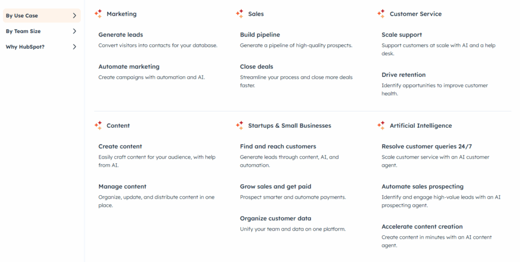
HubSpot: Products, Solutions & Resources Mega Menus
HubSpot has several really good examples of mega menus in their navigation — and it’s clear that they rely on mega menus heavily to organise the content on their site because they have so many pages!

While their About menu uses a standard dropdown, their Products menu is a classic example of a mega menu with:
- Multiple product categories with descriptive icons
- Microcopy to further explain products, like “marketing automation software” for their Marketing Hub
- Separate call-to-action buttons
- Distinct sections for different product categories
HubSpot’s website has a lot of different resources, but their Resources mega menu makes it easy for users to find exactly what they need by categorising content by type, such as education, tools, and community. Meanwhile, their Solutions mega menu allows users to filter by use case (Marketing, Sales, Customer Service, etc.) or team size.
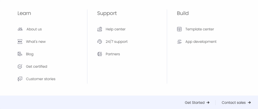
Monday.com: Products, Solutions & Resources Mega Menus
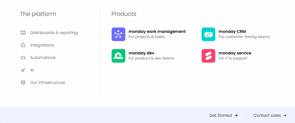
Monday.com has the same mega menu types as HubSpot, but their implementation is slightly different, so it’s worth comparing the two. For example, their menus include features like:
- Clear visual separation between content types
- Strategic call-to-action placement
- Categorising options by company size, teams, and industries
- Two different styles of icon, with icons for every page listed in the mega menu
- A cleaner, more focused resources section
Now, let’s get into a few examples that are Brew websites…
STA Consulting: Evolving from a Services Dropdown to a Mega Menu
When we first worked with STA Consulting to build their website, they had six core services that fit perfectly into a standard dropdown Services menu. This included Soil Testing, Foundation Engineering, Building Inspections, Structural Engineering, Hydraulic Engineering, and Geotechnical Engineering.
But after a couple of years, they wanted to showcase specific sub-services within each main category service — a total of 25 sub-services plus six parent services. For example, Soil Testing would include Site Classification Soil Test, Wind Classification, and Salinity Soil Test.
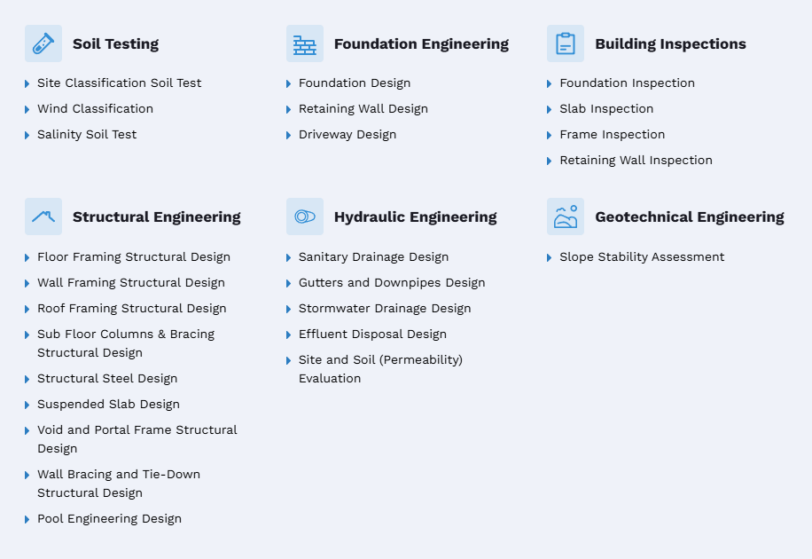
Rather than hiding these pages in nested dropdowns, we created a mega menu that displays all services and sub-services clearly. We added icons to make it visually engaging while keeping everything organised under clear parent categories.
KangaTraining Australia: Showcasing Classes via a Mega Menu
When we built KangaTraining Australia’s site, we wanted to make it super easy for busy parents to consume class information so they could get straight into finding a trainer and booking a class. With nine different types of classes, linking to all of them in a standard Classes dropdown menu could have overwhelmed users. The branded titles of the classes also weren’t clear enough on their own to communicate what a class might cover, compared to other similarly named classes (e.g. Kangatraining, KangaMix, KangaBurn). So, we implemented a mega menu solution that included:
- Visual icons for each class type
- Descriptive microcopy so users could understand each option at a glance
- A “Learn About All Classes” link
- A “Find a Class” call-to-action with an eye-catching map image hinting at what they’d see once they clicked through
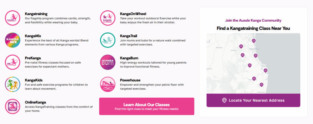
The result? Users can quickly identify the right class for their needs on hover without clicking through multiple pages so they can take action (book a class!) sooner. But if they want to learn more, it’s easy to click on the page they’re interested in.
The Digital Brew: Improving UX With a Simple Services Mega Menu
At the moment, our own website, The Digital Brew, has its own little mega menu. You can see it when you hover on Websites. Although this menu has a single column layout, it’s still classified as a mega menu because of other design features, including:
- Two core services displayed at the top with icons and larger text
- Secondary/supporting services displayed underneath in smaller font and a different background colour
We could have stuck with a standard dropdown menu here because it’s not too many links. But it’s still a lot of services to take in at a glance. The design directs people’s eyes to the most important services first, making our core focus and expertise really obvious, without hiding the full scope of our services.
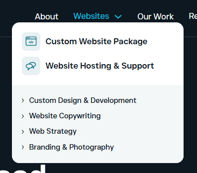
In future, we might also look at converting our Resources dropdown to a mega menu so that we can dynamically display our most recent content directly in the navigation menu, hopefully increasing click-through rates and time on site!
Feel free to try it for yourself ⬆️
Angela Rodgers Copywriter: Services & Industries in One Epic Mega Menu
Recently, Stew helped to convert my own Services menu into a mega menu because I wanted to add more services and industry landing pages (these are a work-in-progress). It’s a lot of pages, but it was important to me that I communicate my offers and expertise more clearly and transparently, while increasing my website’s visibility for relevant keywords in search.
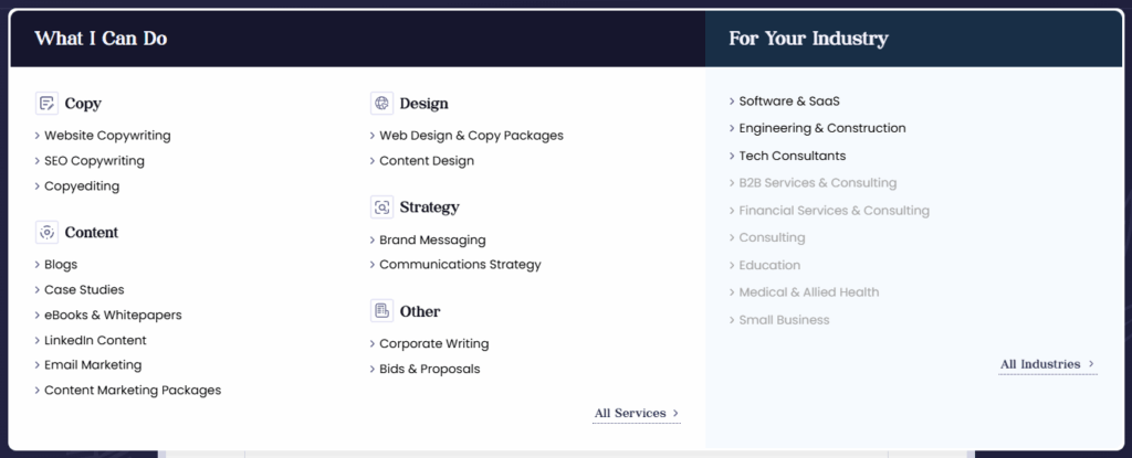
The standard dropdown would have been overwhelming and visually unappealing, so a mega menu was essential! Now, users can see what I do (services) and who I serve (industries) in one clear view, complete with icons and categories.
Check out my site to see the Services mega menu
Mega Menus: Why I Love Them
As you can tell, I’m a bit of a mega menu fangirl right now. But who can blame me? They can do so many good things for website users and businesses, like:
- Show everything at a glance: Users can see all their options or your full service offering immediately without hunting through multiple dropdowns or pages
- Organise links: Group items logically (with useful context like images, icons, headings, and microcopy) to make navigation intuitive for users, even if you have a lot of content or pages
- Visual appeal: Unlike simple text links, mega menus can incorporate design elements that make your navigation visually engaging, on-brand, and a joy to interact with
- Better user experience and conversions: When users can easily find what they’re looking for and love interacting with your site, they’re more likely to stick around and take action
Does Every Website Need a Mega Menu?
So, does everyone need a mega menu? Probably not. For many small businesses, mega menus aren’t essential because they don’t have a huge amount of content to organise or link to in their menu. If you only have a handful of pages or services, a standard dropdown menu will do the trick.
However, I’d still consider them a “nice to have” feature for many small businesses and basic sites.
Even if you have limited pages, a mega menu can help you create a more visually engaging experience and communicate key info about your business or offers.
For example, if you have a single services page that lists multiple service types, it might still be worth using a mega menu to link to different sections within that page. It’ll add extra context to your menu (like different aspects of your service offering) that users can see without needing to click through. And you can do cool things like include photos, icons, short service descriptions, and a main CTA (like “Get a Quote”), all within your menu.
Tell Me: Do You Love a Good Mega Menu, Too?
To sum it up, mega menus can make the greatest impact when you have multiple products or services to showcase, content that could benefit from categorisation, plans to boost your site’s visual appeal and user experience, or website content that’s outgrowing a standard navigation.
If your current dropdown menu is starting to feel cramped or confusing, a mega menu upgrade could make a real difference to UX, engagement, and conversions.
But I’d love to hear what you think. Do you also enjoy a good mega menu? Seen any cool ones you’d like to share? Or maybe you’re opposed to mega menus? Feel free to share your thoughts in the comments!